

THE ART OF RETURNING:
A brand identity for a multidimensional guide, woven from the tension between wild aliveness and quiet safety.
The vision
Juliet’s work lives in the deep waters of somatic healing and spiritual devotion, yet her previous brand felt too narrow to hold the full spectrum of her magic. The vision was to move beyond the "yoga teacher" label and create a container that matched her actual presence: human-first, ego-free, and profoundly safe. We set out to build a visual world that didn't just market a service, but signaled a sanctuary, a brand that felt like a deep exhale and a steady hand on the back.


The feel
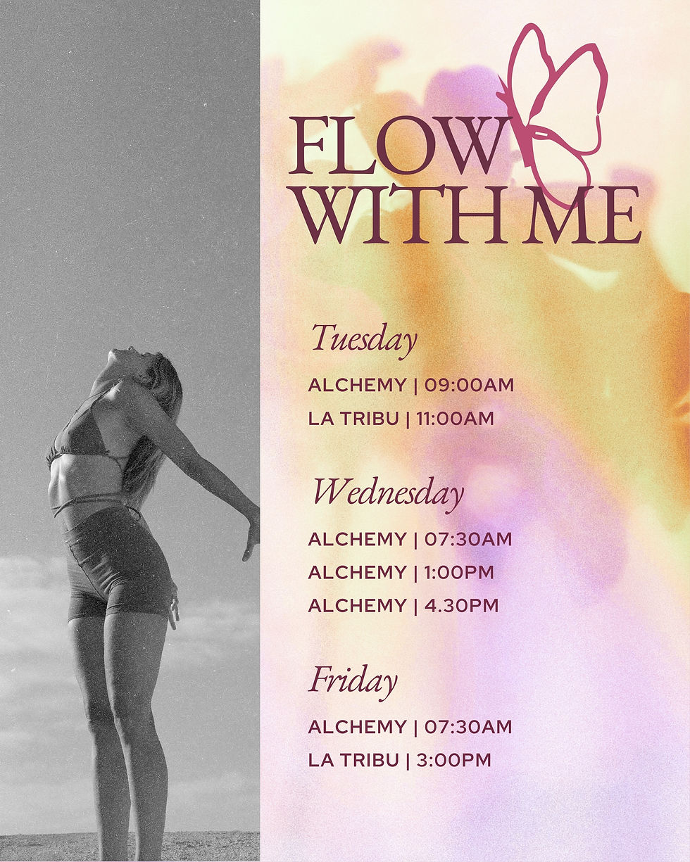
This is a brand felt through the senses. It’s the contrast of skin and stone, the rhythm of movement, and the beauty of flowers in their natural, messy cycles of growth. We stepped away from the "earthy" tropes of traditional wellness to embrace a more artistic and embodied energy. It’s a palette of sun-warmed minerals and deep, magnetic berries. It doesn't look like a clinical practice; it looks like a life well-lived. It is bold, human, and unapologetically alive.

.jpg)

The outcome
A visual and strategic home that finally fits the woman behind the work. This identity doesn't promise a "better version" of the self or a new set of rules to follow; instead, it signals a return to what is already true. By centering human presence over performance, the brand now acts as a clear invitation for people to stop "trying" at wellness and start inhabiting their own aliveness. It is a distinctive, grounded, and magnetic space that reflects Juliet’s role as both a steady guide and a wild, creative force.



KIND WORDS
"Working with Helly has been such a beautiful experience. She created my branding and website, and somehow managed to capture not just what I do, but who I am and the feeling I wanted people to have when they landed on my page.
I was so amazed by how organized she is and how she curated the entire journey. At times, it almost felt like she was coaching me, helping me reflect on my offerings more deeply and articulate them more clearly. She also has an incredible eye for design, so the whole process was exciting, inspiring, and genuinely enjoyable.
Throughout the entire process, I felt listened to, supported, and guided. The final result feels so aligned with me and my business, and I’ve received so many compliments on it. I couldn’t be happier with the outcome!
If you’re looking for someone who combines creativity, professionalism, and genuine care, I couldn’t recommend Helly more. Thank you for bringing my vision to life."
Juliet Leger Mairry, Somatic Therapist